
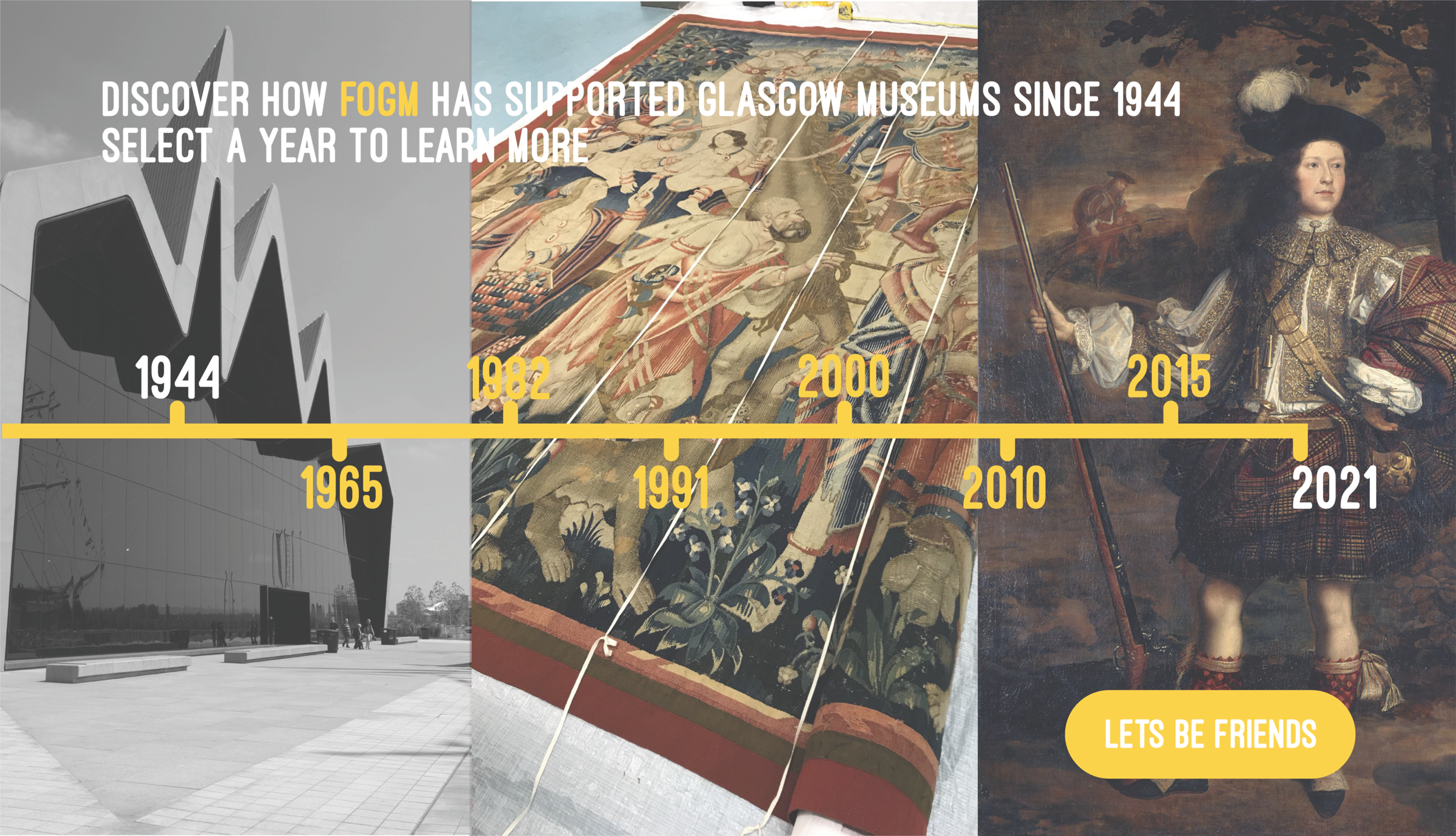
Friends of Glasgow Museums
Friends of Glasgow Museums (FOGM) is a community of like-minded individuals that has protected, supported and celebrated Glasgow Museums since 1944. In 2020 they reached out to create a re-brand of their organisation, the goal was to reach a younger and more diverse audience whilst still connecting with their current and valued members and staying true to the heritage of FOGM. The key take aways were to keep the brand elegant, inclusive, community driven and help drive more visibility for the organisation which currently feels dated and tired.
The Re-brand
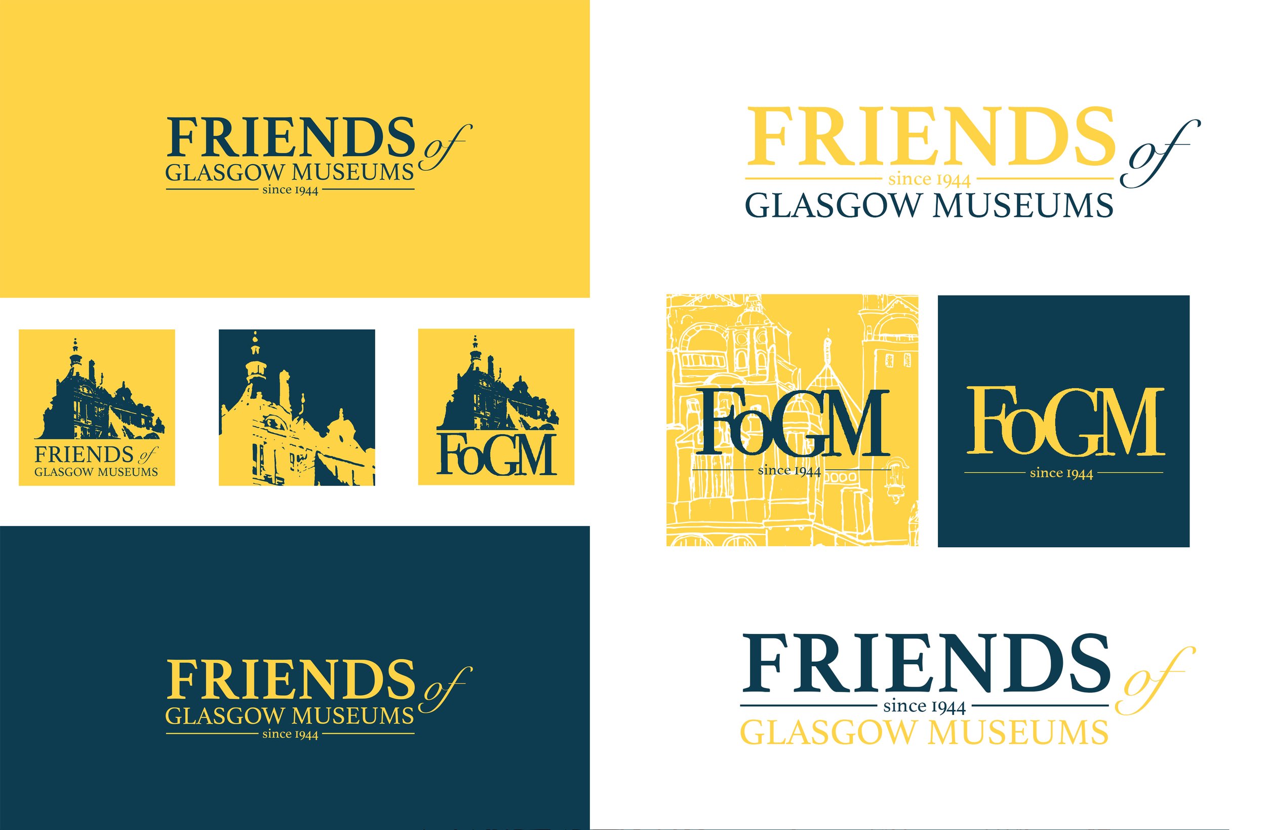
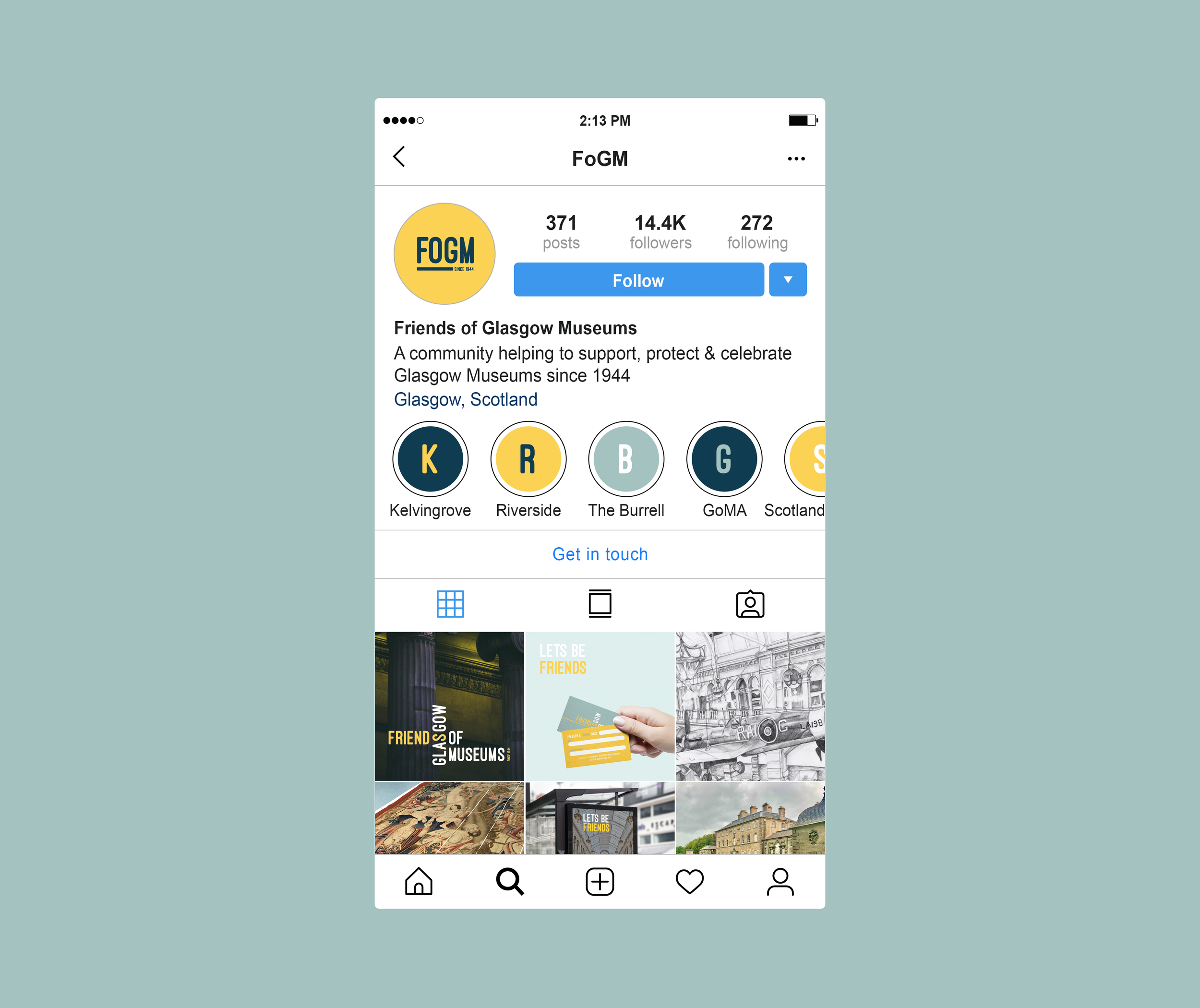
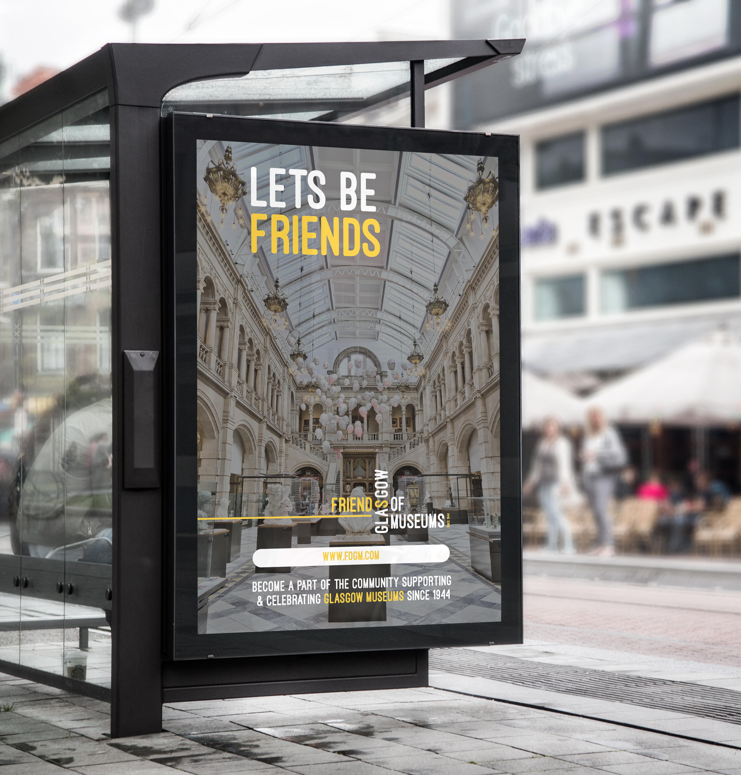
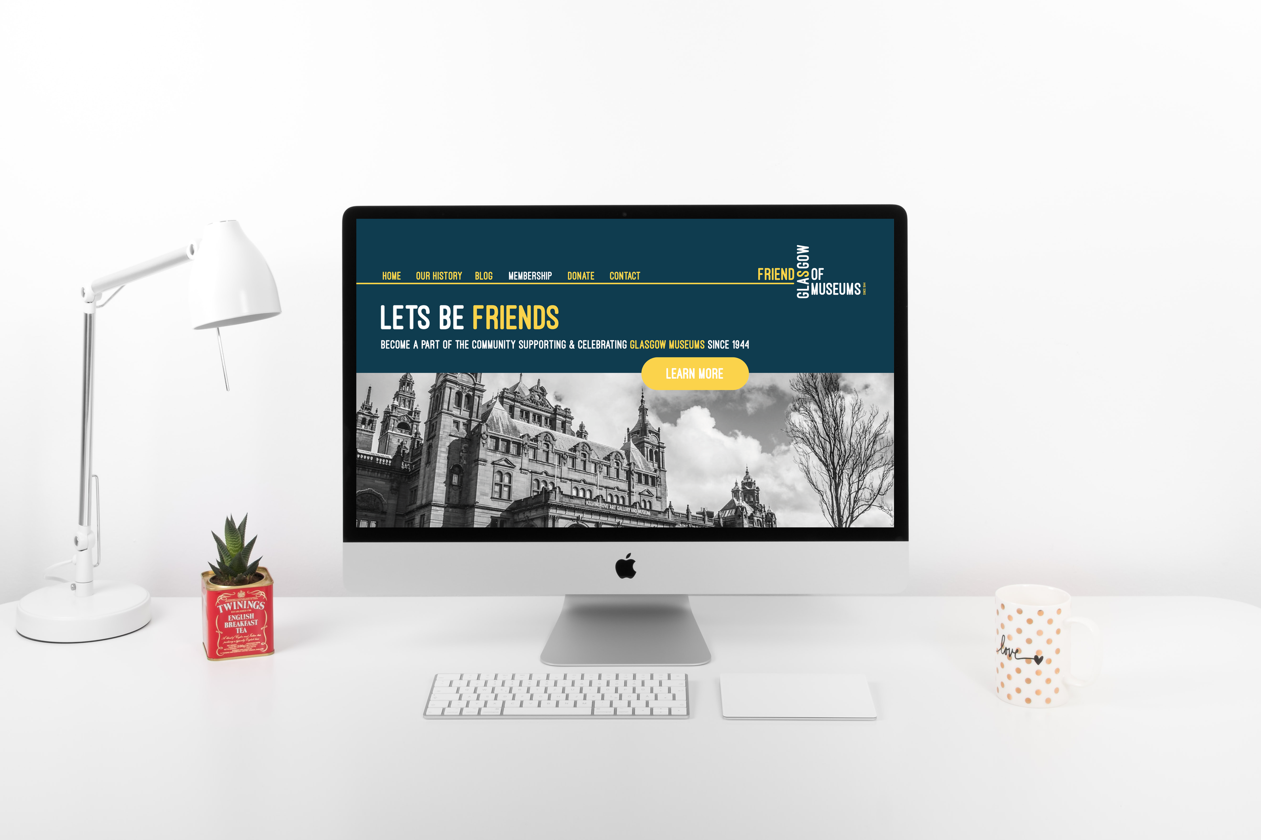
The focus of my proposed logo re -branding was on the language, people & strong heritage of the company. By using the appropriate language the logo is allowed to feel more inclusive and welcoming of all, a key point that the company highlighted they wished to achieve in their new logo. Throughout the branding I wanted to introduce terms such as ‘lets be friends’ and also use ‘I am a friend’ and ‘dear friend’ as opposed to dear sir/madam in letters/emails. By not using generic terms which make individuals feel like a ‘consumer’ or ‘customer’ it helps each person feel valued and like part of a community. This allows the company to feel more inclusive and welcoming to all, as well as prevent the hard sale tactic that the company wished to avoid.
I chose to have the words FRIENDS, and GLASGOW slot together like building blocks to show the importance of the connection between the organisation and the physical Glasgow Museum buildings. The stroke line represents the longevity and the timeline of the Friends of Glasgow museums whilst the added ‘since 1944’ encapsulate the heritage behind the organisation.
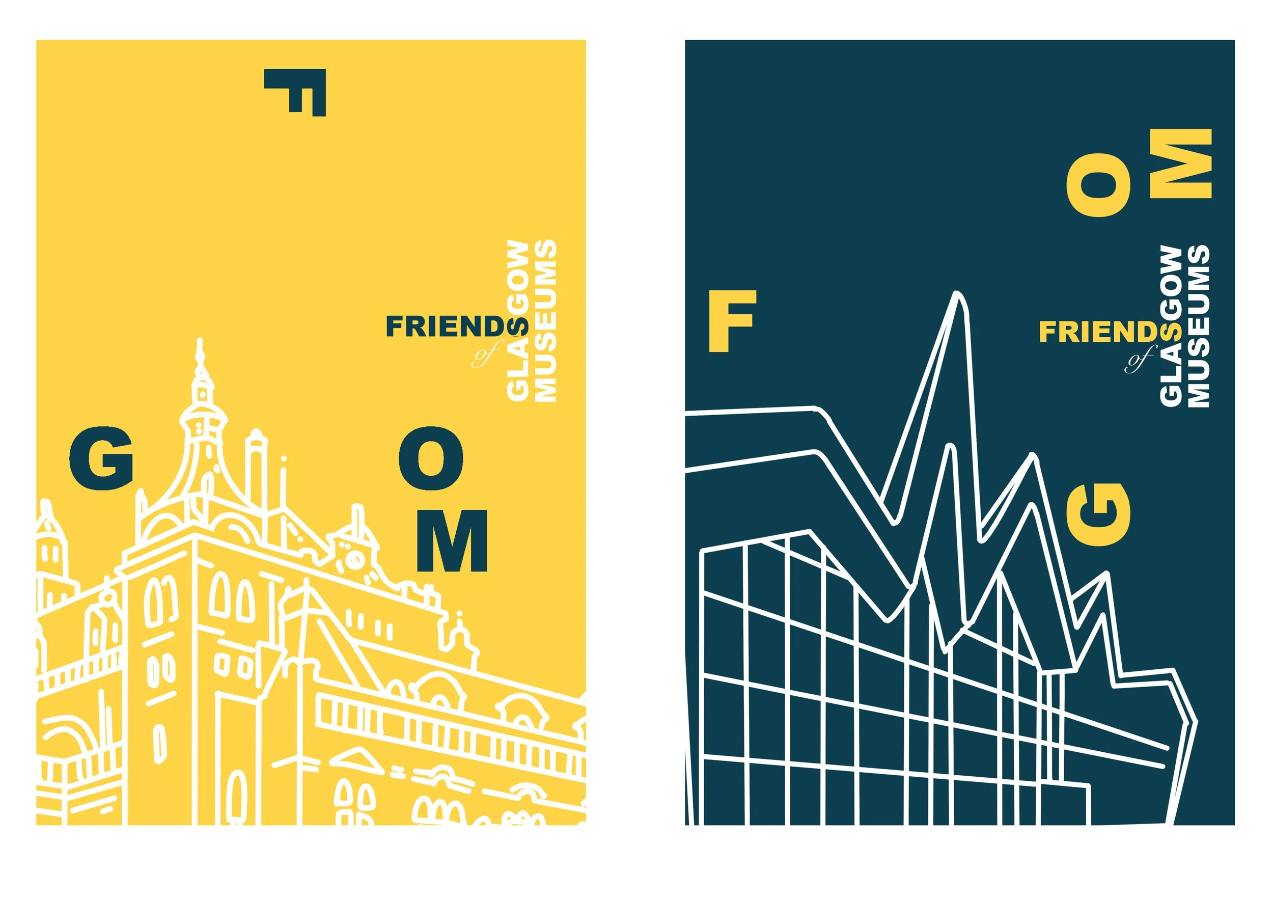
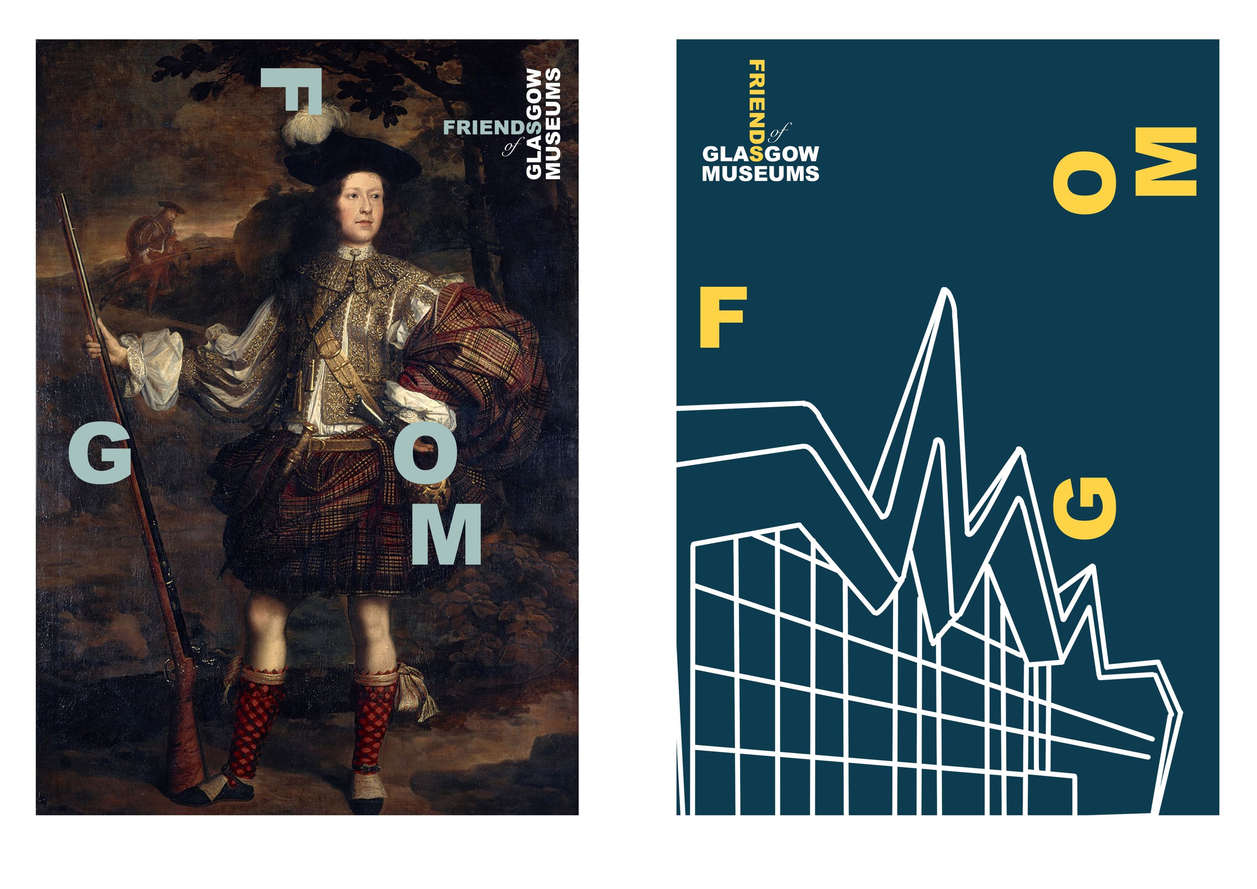
Below: Variations on logo and branding concepts before final choice

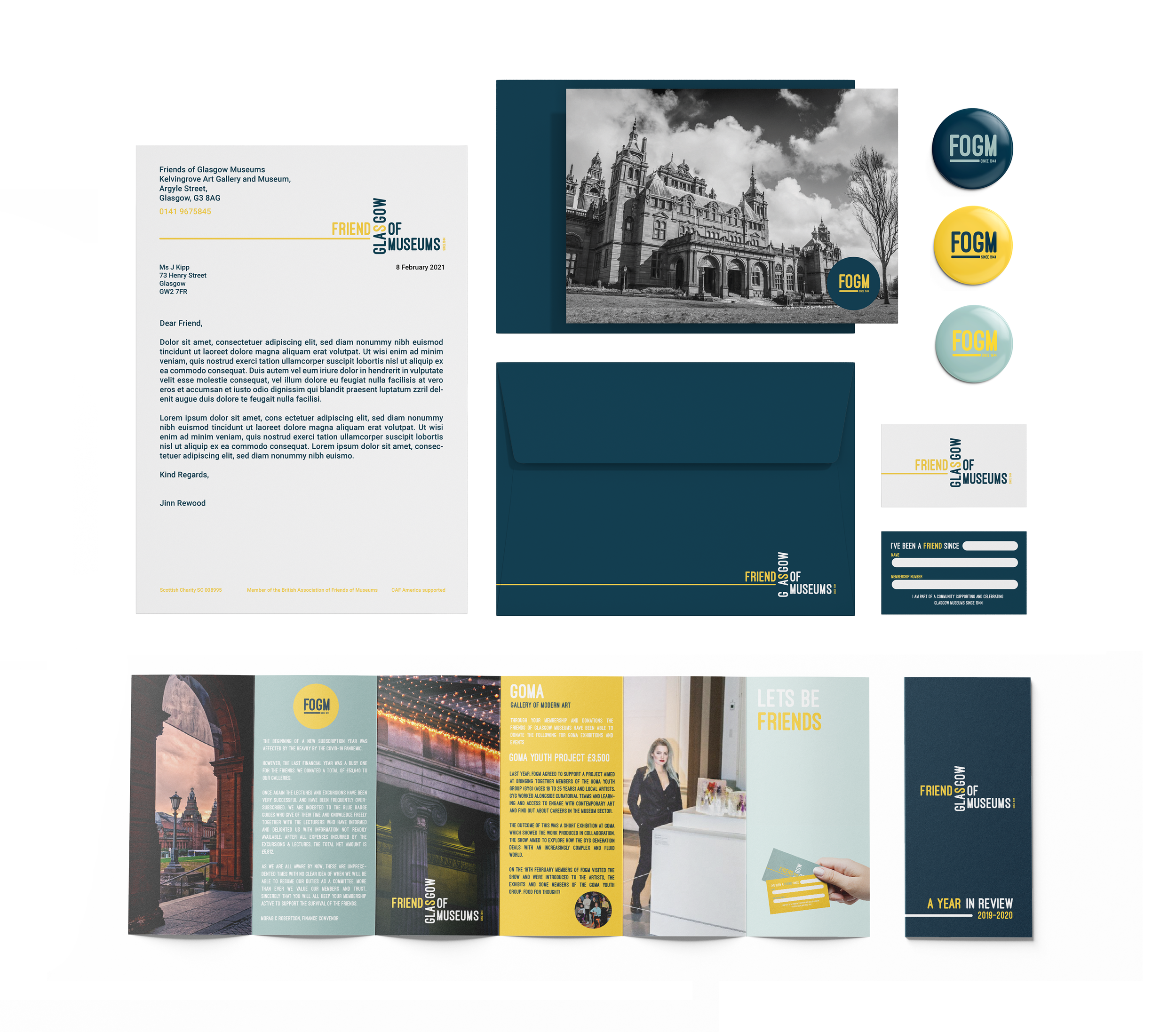
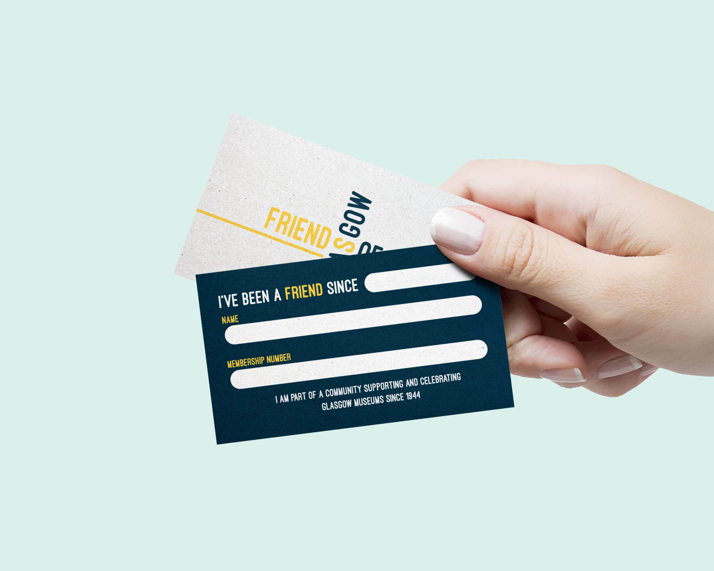

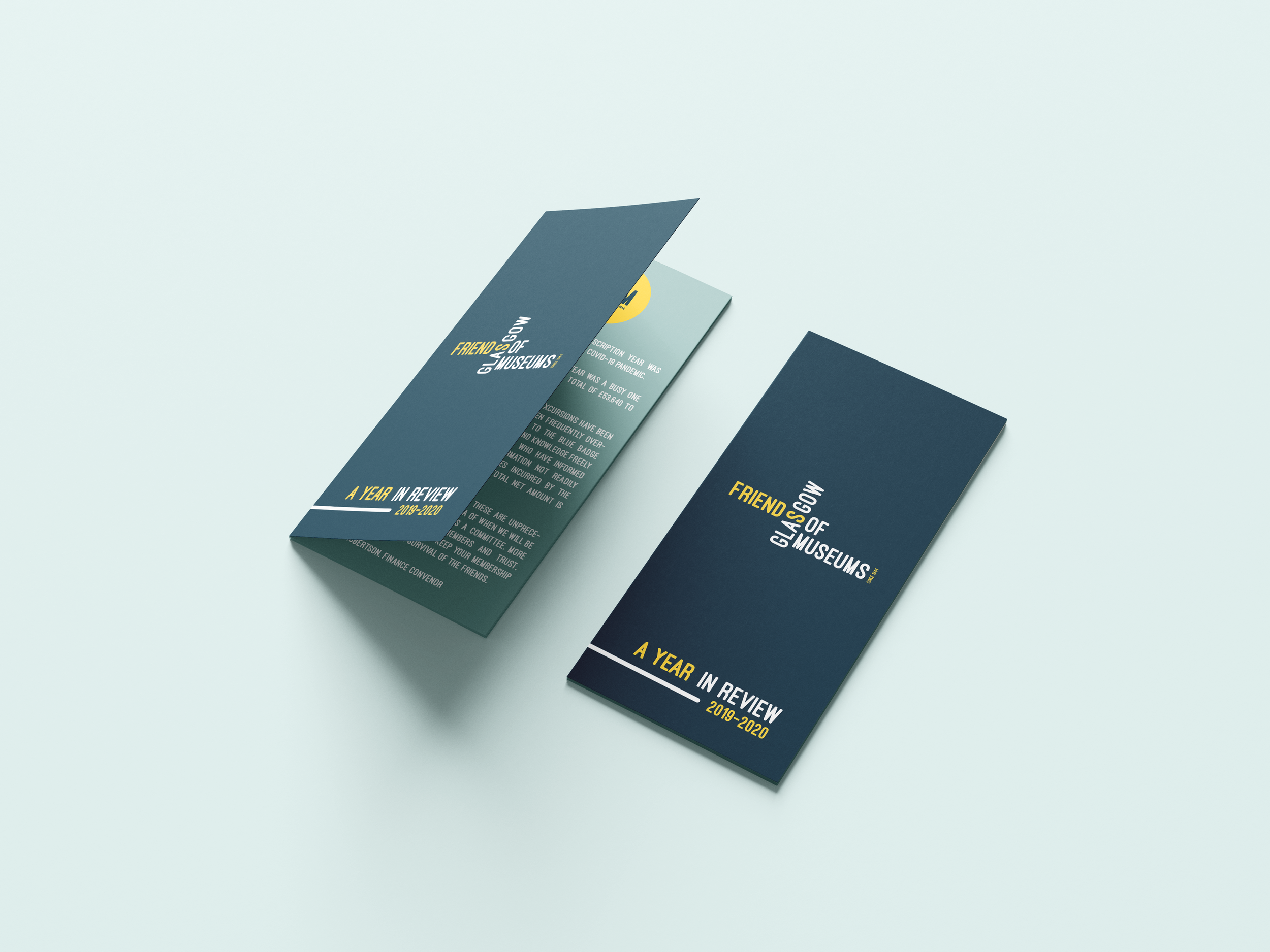
Membership Cards
The membership cards utilises the language of the brand, putting emphasis on the aspect of becoming a friend and part of a community. The membership card allows each person to add a start date, which echoes the branding and history behind the company with 'since 1944' taking prominence in their logo.
Client Feedback
“It was a great modern design which emphasised the 'Friends' as an organisation, and a link I for one have been pushing for. Using terms such as 'best friends' etc as a way to reinforce the importance of our connection to our Members was very appropriate; so very well done.”