

Scaramanga
Scaramanga is a 2 piece electronic outfit from Glasgow, Scotland. Fusing electro, trance and rock since 2020. In 2021 they were looking for an overall re-brand of their logo to give them a sense of identity. The design was to be minimal, futuristic and perhaps with a little tongue and cheek to show the personality of the band and their chosen name.
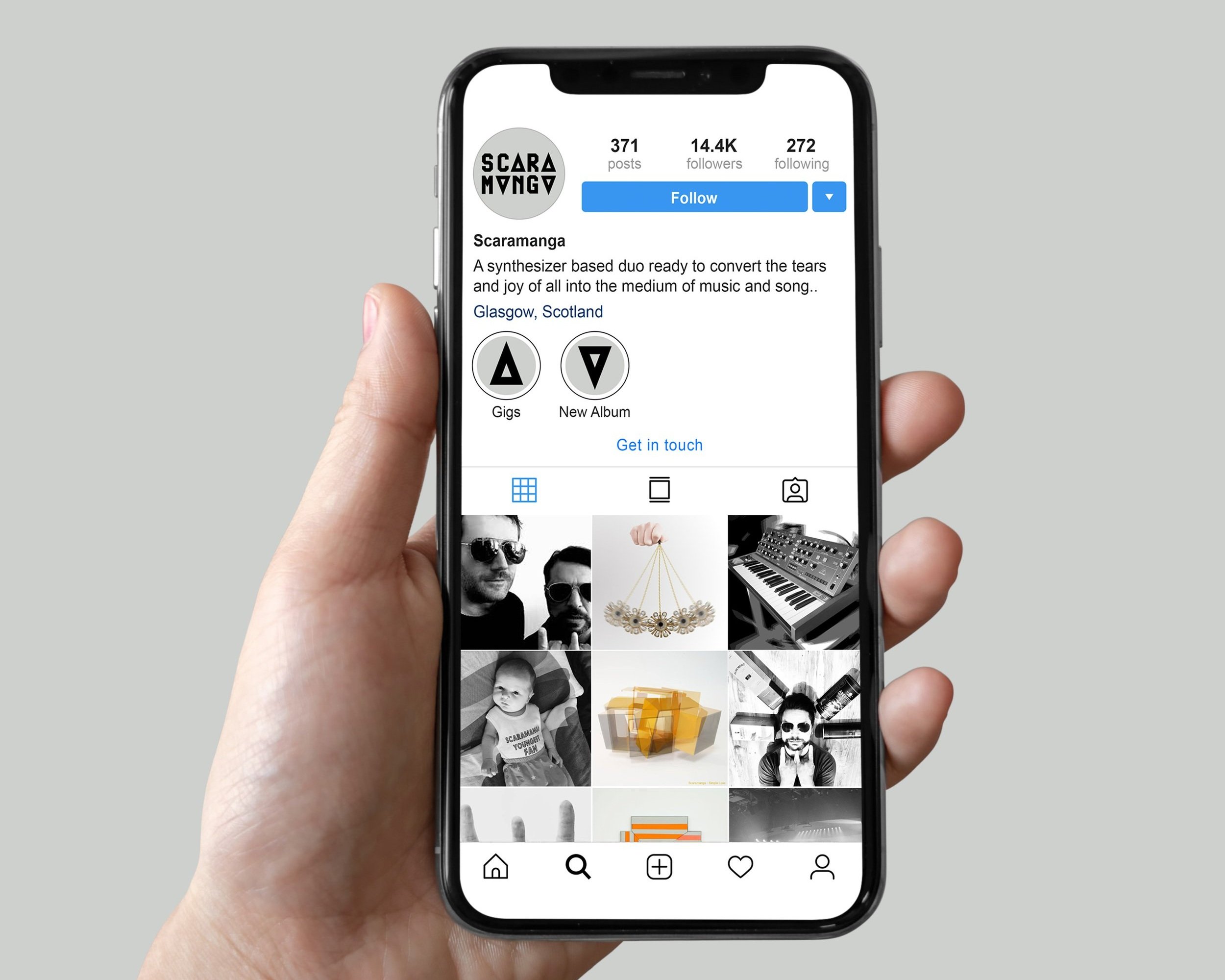
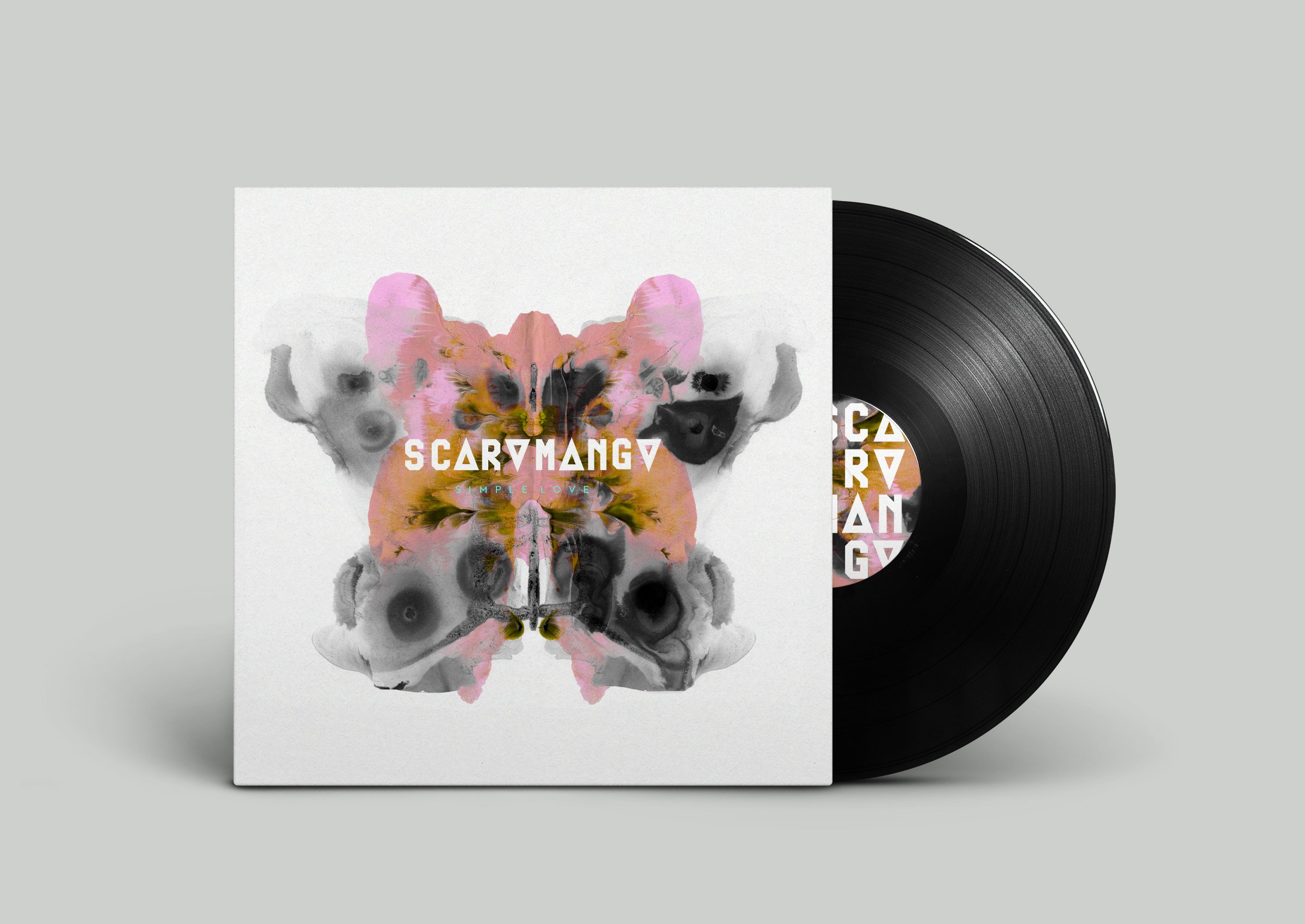
My final concept takes inspiration from the theme of collaboration. Scaramanga is a duo that once was three, I wanted to play on that element by using a simple yet distinctive shape synonymous with the idea of three, a triangle. This also plays into the name of the band and it’s relation to the character Scaramanga and his infamous three nipples.

The Logo
The design is minimal, timeless, versatile, a little sci-fi inspired and utilises a typeface with a retro come techno feel which works well for the bands unique sound.
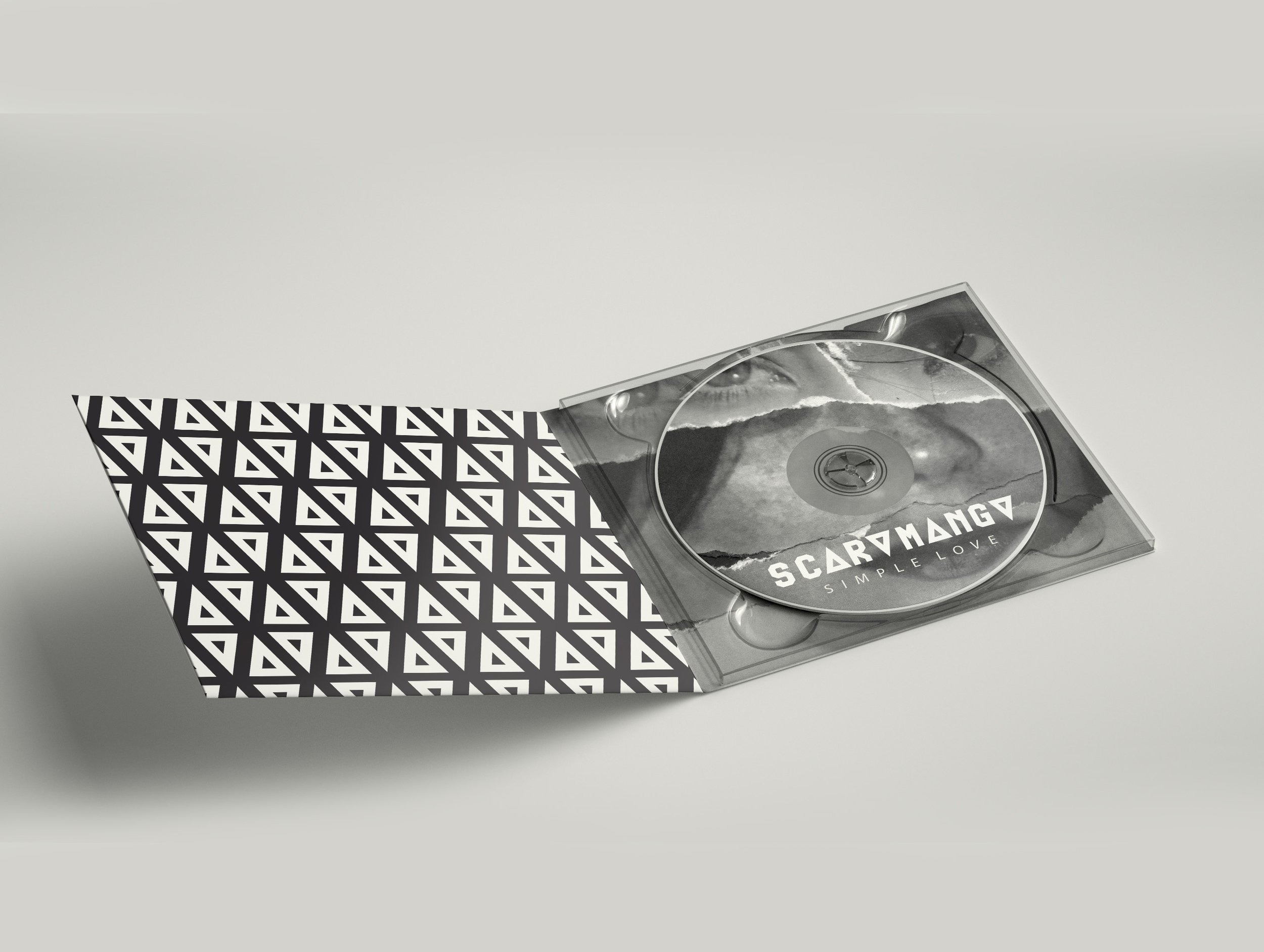
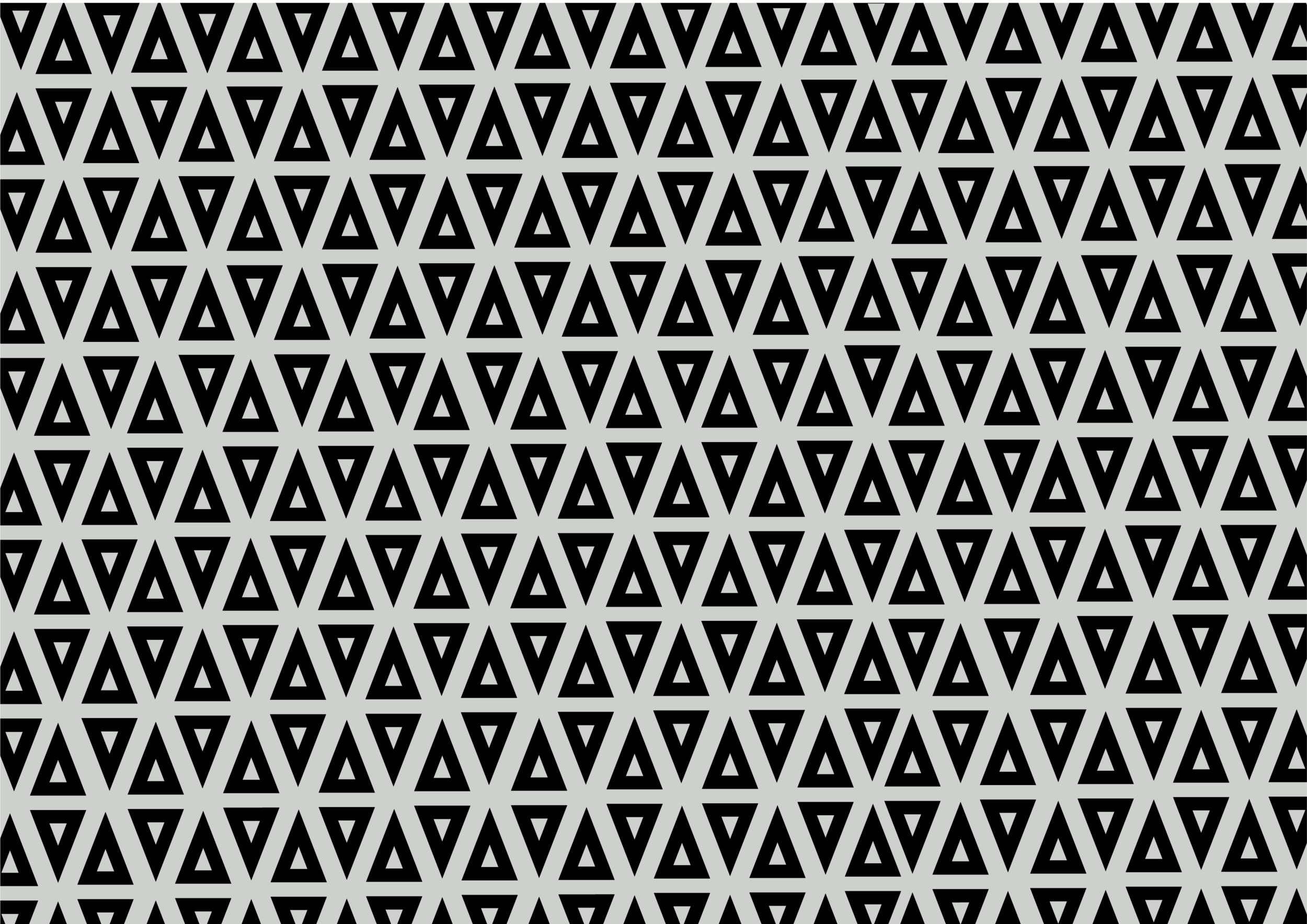
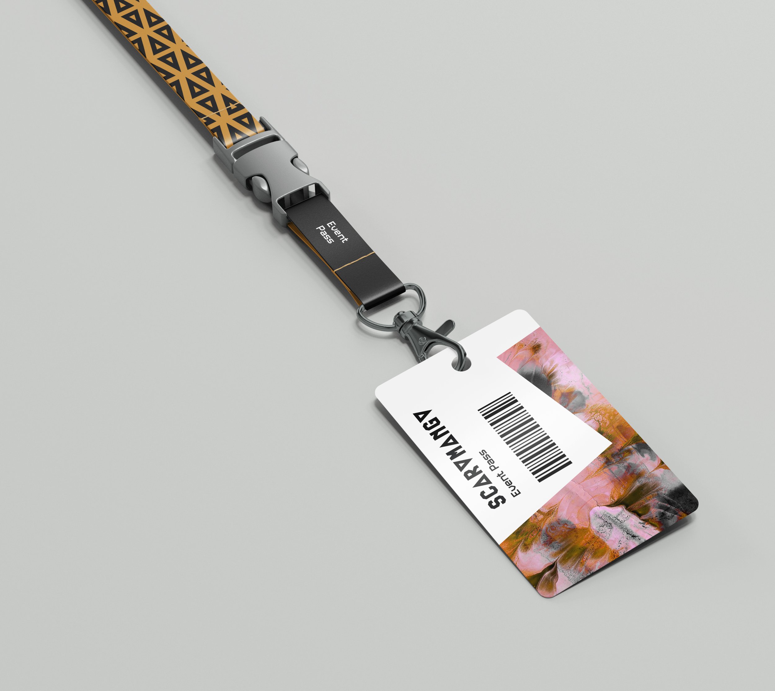
The triangle imagery can be used alone, as a pattern and within other elements to help bring a sense of identity to the bands branding.
Simple colours of a muted ash grey along side black and white offer the ultimate minimalistic feel to ensure that any other imagery is not over shadowed by the logo, ie album covers artwork.
Left: Concepts and variations on development of logo
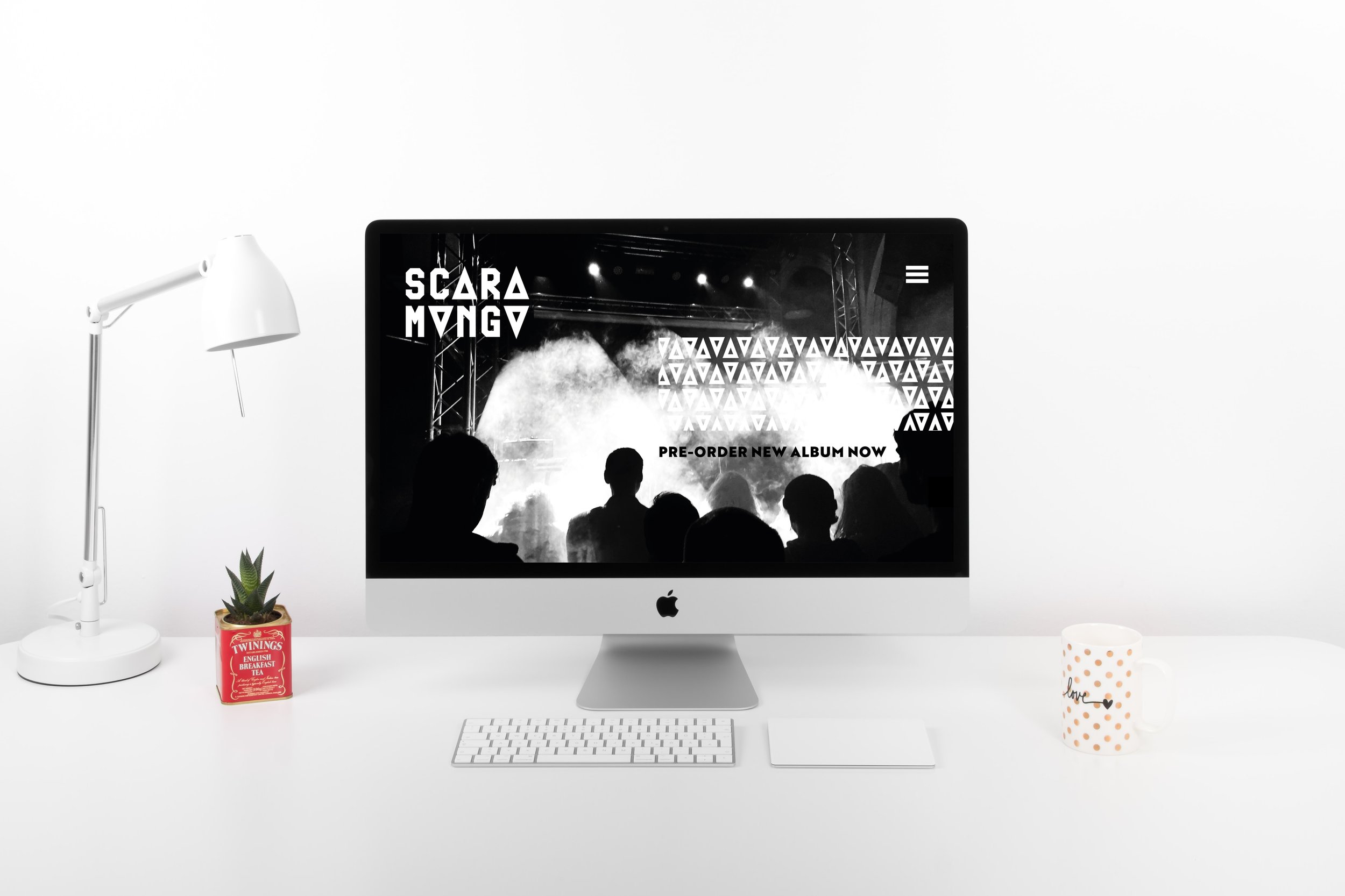


I created a mock up website using XD software for the band. Here are some screenshots from that process.
The brand guideline document was implemented across the site.


